
Gary Hershorne/Reuters
Have
you ever wondered why traffic always slows when people are driving by
an accident? Do you moan about the fact that people are attracted by the
gruesome, and yet find that you glance over too as you drive by? Well,
it’s not really your fault, you (and everybody else) can’t resist
looking at scenes of danger. It’s your “old brain” telling you to PAY
ATTENTION.
You have 3 brains — In my book, Neuro Web Design: What Makes Them Click? I talk about the idea that you really don’t have one brain, you have three. The “new brain” is the conscious, reasoning, logical brain that you think you know best; the mid brain” is the part of the brain that processes emotions, and the “old brain” is the part of the brain that is most interested in your survival.
From reptiles to people — If you look at brains from an evolutionary perspective, the “old brain” developed first (hence the name “old brain”!). In fact, that part of our brain is very similar to the brain of a reptile, which is why some people call it the “reptilian” brain.
“Can I eat it? Can I have sex with it? Will it kill me?” – The job of your old brain is to constantly scan the environment and answer the questions: “Can I eat it? Can I have sex with it? Will it kill me?” That’s really all the old brain cares about, is food sex and danger. When you think about it, this is important. Without food you’ll die, without sex the species won’t continue, and if you are killed the other two questions don’t matter. So animal brains developed early on to care intensely about these three topics. As animals evolved they developed other capacities (emotions, logical thought), but they retained a part of their brain to always be scanning what is going on for these three critical questions.
You can't resist — What this means is that you just can’t resist noticing food, sex, or danger. It doesn’t matter how hard you try to not notice these 3 things in your surroundings, you will always notice them. It’s the old brain working. You don’t necessarily have to do anything once you notice, for example, you don’t have to eat the chocolate cake when you see it, you don’t have to flirt with the attractive person who walked into the room, and you don’t have to run away from the large scary guy that walked in the room with the good looking woman. But you WILL notice all of those things whether you want to or not.
Cake, pretty woman, and a crash on the home page — I get emails from people who have read about the old brain in my book. They will write to me wanting advice about how they should fit a picture of cake, a woman in a bikini, and an industrial accident all at the home page of their corporate website. (I do get some interesting emails!). I’m not advocating that you do that! I am pointing out that if you want to get someone’s attention at a website, then any images or headlines that include or imply food, sex, or danger will definitely get attention. But you will have to decide what is appropriate!
Have you seen any good examples of websites that use these ideas effectively (besides just sex sites — don’t send me URLs for those)?
I
am about to head to Portugal for a week, and I was interested in
exploring different possible destinations in Portugal. I may not have
much time for touring (I’m going to speak at the UXLX conference
there), but if I did have time, where should I go? I have to admit to
pretty much total ignorance about Portugal, the different regions,
landscapes, and parts of the country, so I went to the official tourism
web site for the country.
Give me a little bit at a time — The Portugal tourism site did an OK job of what is called progressive disclosure. This is fancy term that is used in the field of psychology to refer to providing information in increasing chunks of size and complexity.
We can only handle so much — Humans can only process small amounts of information at a time (consciously that is… the estimate is that we handle 40,000,000 pieces of information every second, but only 40 of those make it to our conscious brains). One mistake that web sites make is to give too much information all at once, like this web site from the Canadian government:

There is no chunking here, there is not progressive disclosure. It’s just all the information thrown on the page all at once. The result? You don’t read it, you just leave.
Feeding bits of information – The Portugal site was just OK when it came to progressive disclosure. New Zealand does a much better job. The New Zealand tourism site has multiple levels of disclosure, feeding you the information bit by bit. Here’s the first page on the regions of New Zealand:
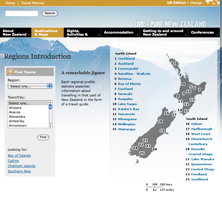
Here, I see the overall map and names of the different regions. If I hover over one of the regions in the list then I see a thumbnail of information:

Continuing on with this idea of progressive disclosure, if I click on that region then I link to a page with more pictures and little more detail:
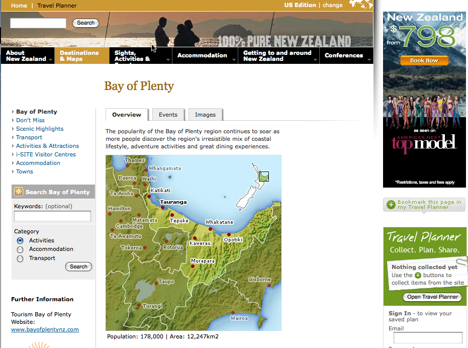
There is a big map and there are tabs to go to for more information. If I scroll down I’ll have details on the region:
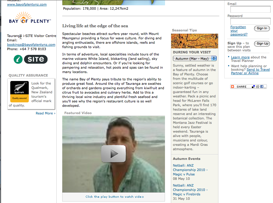
This is a great example of how to use progressive disclosure.
It’s not the clicks that count (pun intended) – One thing I’d like to point out is that progressive disclosure requires multiple clicks. Sometimes you will hear people say that websites should minimize the number of clicks that people have to make to get to the detailed information. The number of clicks is not the important criteria. People are very willing to make multiple clicks, in fact that won’t even notice they are making the clicks, if they are getting the right amount of information at each click to keep them going down the path.
Think progressive disclosure, don’t count clicks.
Should I let the web site design influence whether I book a ticket? Not this time at least. This time I’m headed for Portugal, where I plan to use the Portugal tourism site as a case study in my workshop!
Give me a little bit at a time — The Portugal tourism site did an OK job of what is called progressive disclosure. This is fancy term that is used in the field of psychology to refer to providing information in increasing chunks of size and complexity.
We can only handle so much — Humans can only process small amounts of information at a time (consciously that is… the estimate is that we handle 40,000,000 pieces of information every second, but only 40 of those make it to our conscious brains). One mistake that web sites make is to give too much information all at once, like this web site from the Canadian government:
There is no chunking here, there is not progressive disclosure. It’s just all the information thrown on the page all at once. The result? You don’t read it, you just leave.
Feeding bits of information – The Portugal site was just OK when it came to progressive disclosure. New Zealand does a much better job. The New Zealand tourism site has multiple levels of disclosure, feeding you the information bit by bit. Here’s the first page on the regions of New Zealand:
Here, I see the overall map and names of the different regions. If I hover over one of the regions in the list then I see a thumbnail of information:
Continuing on with this idea of progressive disclosure, if I click on that region then I link to a page with more pictures and little more detail:
There is a big map and there are tabs to go to for more information. If I scroll down I’ll have details on the region:
This is a great example of how to use progressive disclosure.
It’s not the clicks that count (pun intended) – One thing I’d like to point out is that progressive disclosure requires multiple clicks. Sometimes you will hear people say that websites should minimize the number of clicks that people have to make to get to the detailed information. The number of clicks is not the important criteria. People are very willing to make multiple clicks, in fact that won’t even notice they are making the clicks, if they are getting the right amount of information at each click to keep them going down the path.
Think progressive disclosure, don’t count clicks.
Should I let the web site design influence whether I book a ticket? Not this time at least. This time I’m headed for Portugal, where I plan to use the Portugal tourism site as a case study in my workshop!

Imagine
that you’ve never seen an iPad, but I’ve just handed one to you and
told you that you can read books on it. Before you turn on the iPad,
before you use it, you have a model in your head of what reading a book
on the iPad will be like. You have assumptions about what the book will
look like on the screen, what things you will be able to do, and how you
will do them—things like turning a page, or using a bookmark. You have a
“mental model” of reading a book on the iPad, even if you’ve never done
it before.
If you’ve used an iPad before, your mental model of reading a book on an iPad will be different than that of someone who has never used one, or doesn’t even know what an iPad is. If you’ve been using a Kindle for the past year, then your mental model will be different from someone who has never read a book electronically. And once you get the iPad and read a couple of books on it, whichever mental model you had in your head before will start to change and adjust to reflect your experience.
What is a mental model? –The term mental model has been around for at least the last 25 years. One of my favorite definitions is from Susan Carey’s 1986 journal article, “Cognitive science and science education”, which says:
“A mental model represents a person’s thought process for how something works (i.e., a person’s understanding of the surrounding world). Mental models are based on incomplete facts, past experiences, and even intuitive perceptions. They help shape actions and behavior, influence what people pay attention to in complicated situations, and define how people approach and solve problems.”
Users create mental models very quickly — often before they even use a website or a product. Users’ mental models come from their prior experience with similar sites or products, assumptions they have, things they’ve heard others say, and also from their direct experience with the product or device. Mental models are subject to change.
Mental models vs. conceptual models –In order to understand why mental models are so important to design, you have to also understand what a conceptual model is and how it is different from a mental model. A mental model is the representation that a person has in their minds about the object they are interacting with. A conceptual model is the actual model that is given to the person through the design and interface of the actual product. Going back to the iPad ebook example, you have a mental model about what reading a book will be like in the iPad, how it will work, what you can do with it. But when you sit down with the iPad, the “system” (the iPad) will display what the conceptual model of the book app actually is. There will be screens, and buttons, and things that happen. The actual interface is the conceptual model. Someone designed an interface and that interface is communicating to you the conceptual model of the product.
Why care about this mental model/conceptual model idea? –Here’s why you should care: If there is a mismatch, between the person’s mental model and the product’s conceptual model, then the product or website will be hard to learn, hard to use, or not accepted. How do mismatches occur? Here are some examples:
A different use of the term – By the way, the way I’m using the term mental model is, I believe, the most common definition, but it does not fit with at least one of the new definitions I’ve been reading and hearing about lately. Indi Young has written a book called Mental Models, and she’s using the term in a different way. She diagrams the behavior of a particular audience doing a series of tasks, including their goals and motivations. Then underneath that she describes what the “system” or product will do, or be like, in order to match the task. This entire structure she calls a “mental model.” Her methodology and its output look useful, but it doesn’t match the definition of mental models that I’m using here.
The Best Designers –a) understand the mental models of the intended audience (with task analysis, observations, interviews, etc), and b) design a conceptual model to fit the audience’s mental model, or a design a new one and know how to get us to switch from old to new.
Take Aways:
If you’ve used an iPad before, your mental model of reading a book on an iPad will be different than that of someone who has never used one, or doesn’t even know what an iPad is. If you’ve been using a Kindle for the past year, then your mental model will be different from someone who has never read a book electronically. And once you get the iPad and read a couple of books on it, whichever mental model you had in your head before will start to change and adjust to reflect your experience.
What is a mental model? –The term mental model has been around for at least the last 25 years. One of my favorite definitions is from Susan Carey’s 1986 journal article, “Cognitive science and science education”, which says:
“A mental model represents a person’s thought process for how something works (i.e., a person’s understanding of the surrounding world). Mental models are based on incomplete facts, past experiences, and even intuitive perceptions. They help shape actions and behavior, influence what people pay attention to in complicated situations, and define how people approach and solve problems.”
Users create mental models very quickly — often before they even use a website or a product. Users’ mental models come from their prior experience with similar sites or products, assumptions they have, things they’ve heard others say, and also from their direct experience with the product or device. Mental models are subject to change.
Mental models vs. conceptual models –In order to understand why mental models are so important to design, you have to also understand what a conceptual model is and how it is different from a mental model. A mental model is the representation that a person has in their minds about the object they are interacting with. A conceptual model is the actual model that is given to the person through the design and interface of the actual product. Going back to the iPad ebook example, you have a mental model about what reading a book will be like in the iPad, how it will work, what you can do with it. But when you sit down with the iPad, the “system” (the iPad) will display what the conceptual model of the book app actually is. There will be screens, and buttons, and things that happen. The actual interface is the conceptual model. Someone designed an interface and that interface is communicating to you the conceptual model of the product.
Why care about this mental model/conceptual model idea? –Here’s why you should care: If there is a mismatch, between the person’s mental model and the product’s conceptual model, then the product or website will be hard to learn, hard to use, or not accepted. How do mismatches occur? Here are some examples:
• The
designers thought they knew who would be using the interface and how
much experience they had with interfaces like this, and they designed
according to those assumptions without testing them, and it turns out
their assumptions were wrong.
• The
audience or the product or website is varied. The designers designed
for one “persona” or type of audience, and the mental model and
conceptual model match for that group, but not for others.
• There
are no real designers. The conceptual model wasn’t really designed at
all, It’s just a reflection of the underlying hardware or software or
database. So the only people whose mental model it fits are the
programmers. If the audience is not the programmers then you are in
trouble.
What if the mental models the users have won’t work?
— What if it’s a brand new concept and you don’t want to match the
current mental model? – What about the idea that people who have only
read real, physical books will not have an accurate mental model of
reading books on the iPad? In this case you know that people will not
have an accurate mental model that fits. You will need to change their
mental model. The best way to change a mental model is through
training. You can use a short training video to change the mental model
before the iPad even arrives at their door. In fact, one of the best
purposes of training on a new product is to adjust the audiences’ mental
model to fit the conceptual model of the product.A different use of the term – By the way, the way I’m using the term mental model is, I believe, the most common definition, but it does not fit with at least one of the new definitions I’ve been reading and hearing about lately. Indi Young has written a book called Mental Models, and she’s using the term in a different way. She diagrams the behavior of a particular audience doing a series of tasks, including their goals and motivations. Then underneath that she describes what the “system” or product will do, or be like, in order to match the task. This entire structure she calls a “mental model.” Her methodology and its output look useful, but it doesn’t match the definition of mental models that I’m using here.
The Best Designers –a) understand the mental models of the intended audience (with task analysis, observations, interviews, etc), and b) design a conceptual model to fit the audience’s mental model, or a design a new one and know how to get us to switch from old to new.
Take Aways:
• People
always have a mental model, and it often doesn’t match what the
conceptual model that someone designed (or forgot to design!).
• The
secret to designing an intuitive and delightful product experience is
making sure that the conceptual model of the product matches, as much as
possible, the mental models of your audience.
• If
you have a brand new product that you know will not match anyone’s
mental model then you will have to provide training to prepare the
person to create a new mental model.
• If
you are struggling to learn how to use a new website, software or
device, it might be because you are holding on to an old mental model
that doesn’t work anymore. Try letting it go and looking at the product
without so many assumptions about how it works.
What do you think? What products have you had a hard time with
because your mental model didn’t match the conceptual model? If you are a
designer, what do you do to try and get a better match?
Aucun commentaire:
Enregistrer un commentaire
Remarque : Seul un membre de ce blog est autorisé à enregistrer un commentaire.